Barfoot & Thompson Apps Portal – Icon Design


I designed a set of simple, consistent icons for Barfoot & Thompson's apps portal. The icons were created to be clear and easy to use, while staying true to the brand's clean and professional style.
Software:
Illustrator
Illustrator
NZMP Icon development – Streamlining the Process
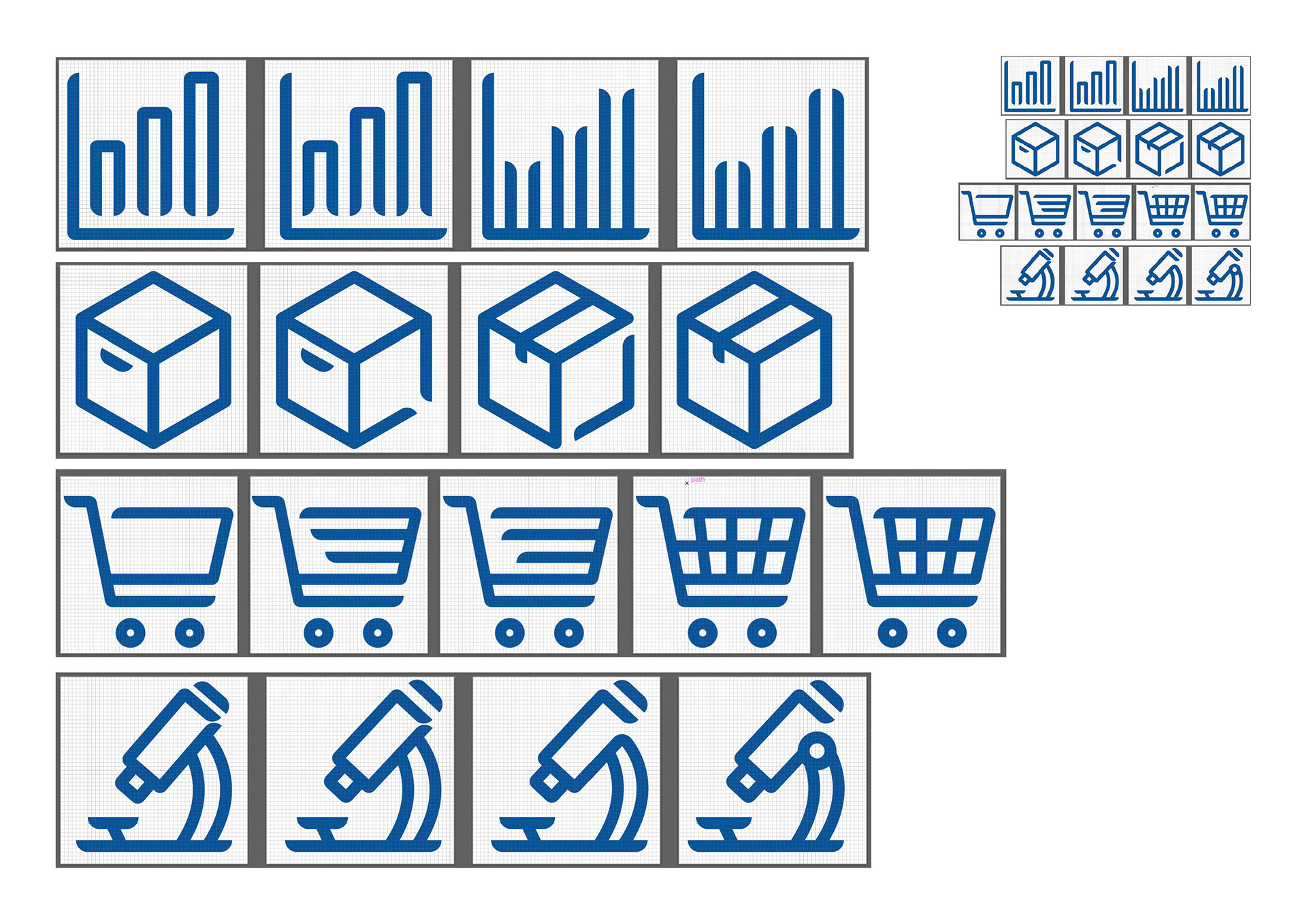
Icons I developed for NZMP while interning at Hula.
I was asked to assist a co-worker in developing icons according to the current NZMP brand guidelines. The creative director highlighted an inconsistency in the curved edges of the icon strokes, and the existing process was too complex and time-consuming. After experimenting, I discovered a way to apply and adjust the stroke curves with a simple button press, significantly speeding up the development process.
This solution allowed me to quickly produce multiple icon concepts in just a few hours, which I then presented to the creative director for approval. The new method improved efficiency and consistency, making the icon creation process much smoother.
Software:
Illustrator
Illustrator
Burger Wisconson Icons
I was instructed to design a set of 6 themed icons using vector graphics and RGB colours. These icons required a particular focus: The development of a mobile app for use by Burger Wisconsin*. Providing they had gone through a recent re-brand I designed the icons according to the existing brand identity.
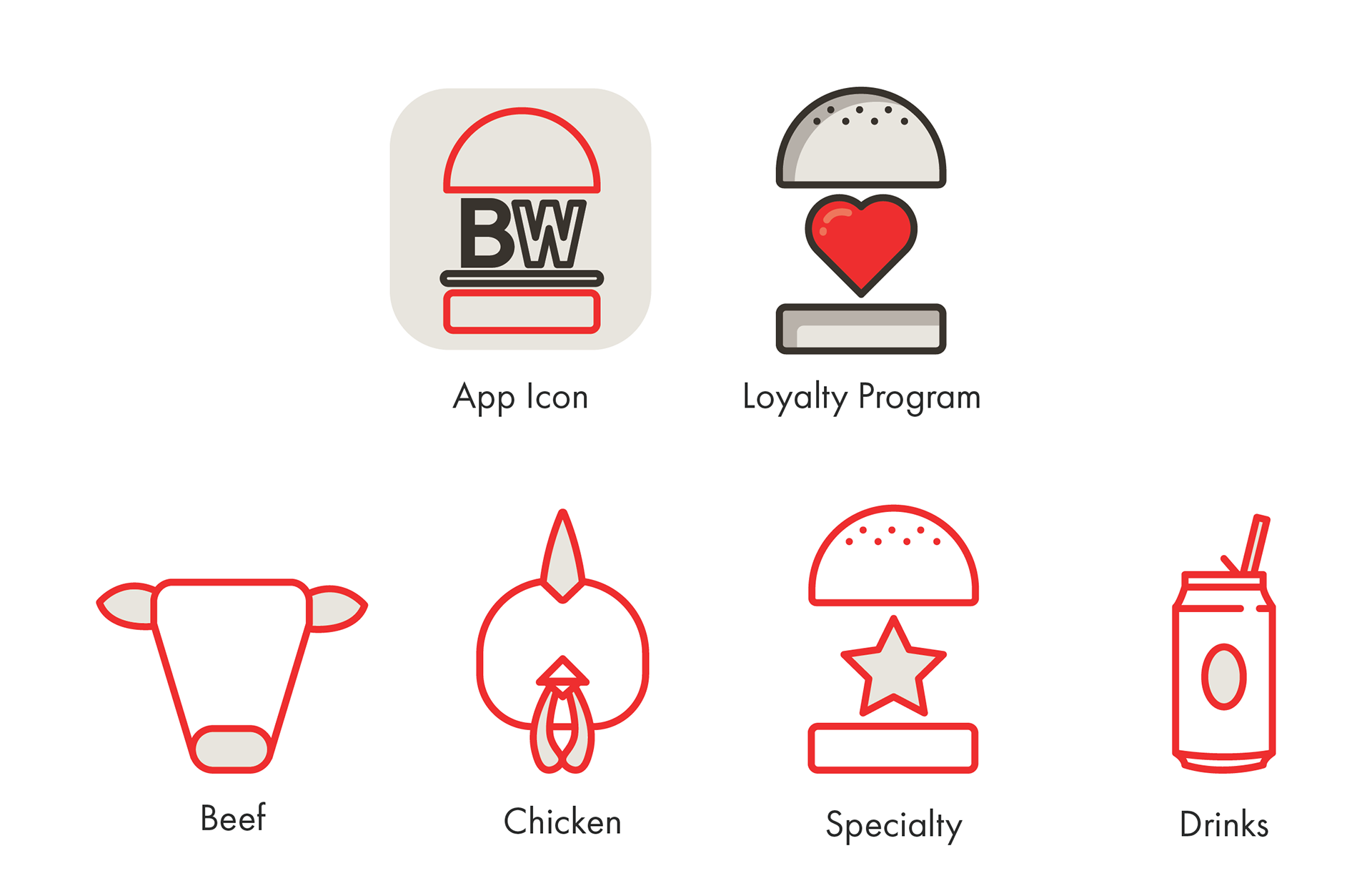
*This was a fictional project
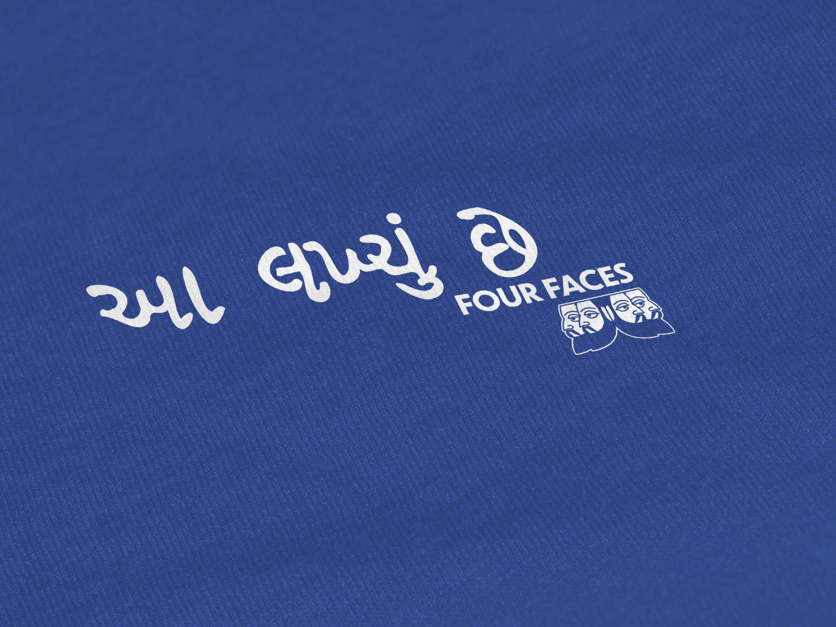
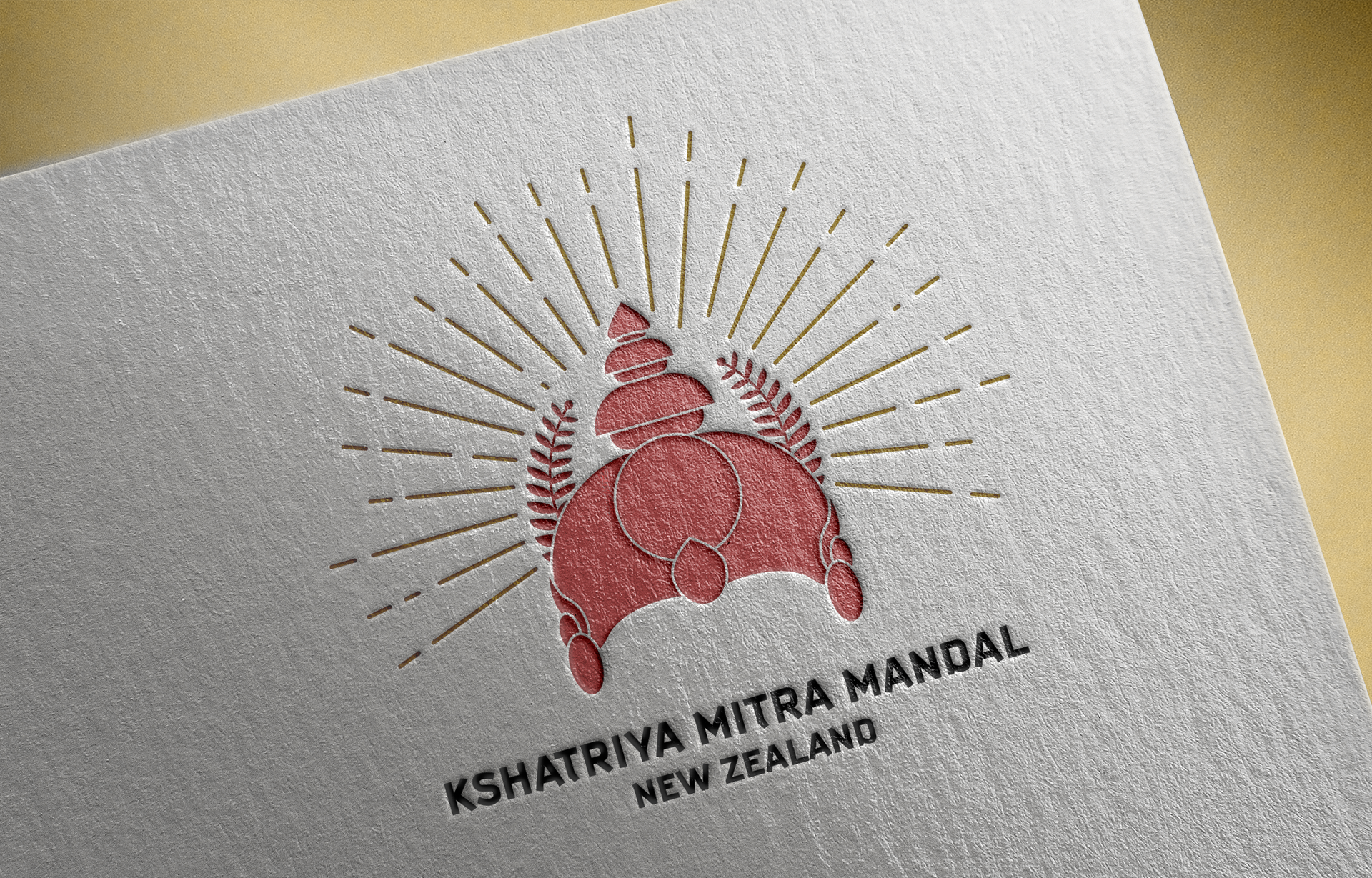
Kshatriya Mitra Mandal New Zealand Logo
I was commissioned to develop a logo for the local Indian community within New Zealand and Wellington. This logo would be displayed on newsletters and other places of advertising. They asked me to design a logo that specifically contained a silver fern.
Software:
Adobe: Illustrator & Photoshop (For Mockups)